The Psychology of Colours in Food
)
It’s often said we eat with our eyes. Long before the first delicious aroma tickles our nose or the first bite captivates our tastebuds, our appetites are piqued by how our food looks.
The psychology of colour studies how different colours evoke different thoughts and feelings and this science also applies to food and how it is presented.
Our subconscious acts as our second stomach when it comes to recognising colours in certain situations. When looking at food, the colours we see can have a significant effect on our appetite and what we choose to consume. Colours have the power to make us feel hungry, sad, happy, relaxed or energetic. In mastering this, restaurants, venues and cafés can understand their consumers a little more including what drives their appetite and what keeps them coming back for more!
Check out Helen’s Hints for a crash course in the psychology of colour and how to expertly incorporate all the colours of the rainbow into your menu, plating and venue.
COLOURS TO INCORPORATE ON YOUR MENU
RED:
Foods that are bright red are often associated with moods of passion and excitement, stimulating the appetite and encouraging people to eat more.
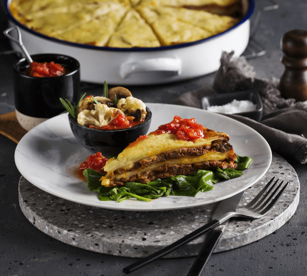
HELEN’S HINT: Cherry tomatoes are a great way to incorporate red hues and ignite excitement. Utilise them as a simple garnish or try our Tomato and Fetta Puff featuring delicious oven-roasted cherry tomatoes and red onion. Add a vivid splash of red by accompanying any of our warm, savoury pastries with a ramekin of tomato relish or sauce.
YELLOW:
Research shows that yellow is the fastest colour our human brains can recognise and process. While it elicits many different meanings, yellow is an appetite stimulant, just like red. It also has a very optimistic aesthetic and transmits a sense of positivity and happiness. You might notice that red and yellow are the two colours most often paired together in fast-food restaurant branding!
HELEN’S HINT: Add yellow-dominant dishes to your menu to help drive positive sentiment among your customers. Serve dishes such as our delicious Banana Bread or Coconut & Mango Bread. If you are looking to add more vibrant yellows to your plates, try an edible flower for a pop of sunshine or keep it simple with a wedge of lemon or a pat of chilled butter on the side.
GREEN:
Unsurprisingly, green is the colour most commonly associated with food that is considered fresh, healthy, natural, organic or vegetarian. The colour is now used widely to symbolise health and well-being.
HELEN’S HINT: A simple yet effective way to add green to your dishes - and value add for your customers - is by adding a leafy green side salad. This is the perfect accompaniment to our tasty savoury products such as the Tender Steak & Guinness Deep Dish Pie. Filling display cases with green vegetable dishes, such as our Baby Spinach & Fetta Frittata, can also entice customers interested in healthy and hearty food.
WHITE:
White portrays a feeling of cleanliness, purity and simplicity and is also often associated with sophistication when used in a minimal style. White is also naturally dazzling and adds brightness, creating a sense of space.
HELEN’S HINT: Adding a sprinkle of fetta on top of our Zucchini and Corn Fritters is an aesthetically pleasing way to add brightness to your plate. Serving food on white tableware is a versatile plating choice that, while simple, can also have a positive subconscious impact on your customers.
COLOURS TO AVOID:
BLACK:
While black signifies elegance, it is not considered appetising in the food theory world.
HELEN’S HINT: Whilst black isn’t ideal in your venue, it’s not always easy to avoid. When offering darker products such as our Chocolate Trio Gourmet Muffin, add coloured garnish such as pink candy or edible flowers to bring lightness to your dish, while still maintaining elegance in your restaurant.
BLUE:
Much like the blue mind theory when it comes to water lovers, foods with blue incorporated throughout are associated with moods of relaxation, freshness, tranquillity and hunger reduction. While wonderful when looking at the ocean, blue is considered the most unappealing colour within the context of food.
HELEN’S HINT: When setting your table, keep use of blue napkins or table settings minimal so your consumers can focus on your delicious dish.
| Tags:Helen's Hints |

